How To Use Graphs And Charts Effectively For Data Visualization
Data visualization is like a delicate dance, where the proper steps and techniques can bring out the beauty of data.
When it comes to using graphs and charts for visualizing data, there are certain rules that you need to follow in order to make sure your presentation is professional and effective.
This article will provide an overview of how to use graphs and charts properly for data visualization so you can confidently create stunning presentations with ease.
Graphs and charts allow us to take large sets of complex data and present them in easy-to-understand visuals.
By learning how to effectively utilize these tools, we can significantly improve our ability to communicate information clearly and efficiently.
With this knowledge, any audience member can gain insight into what the underlying trends or patterns may be without getting lost in a sea of numbers.
Understanding The Different Types Of Graphs And Charts
Line graphs are great for tracking changes over time, whereas bar graphs are great for comparing different values.
Pie charts are perfect for showing proportions of a whole, and histograms are useful for visualizing distributions of data.
All four types of graphs can be used together to create powerful data visualizations.
Line Graphs
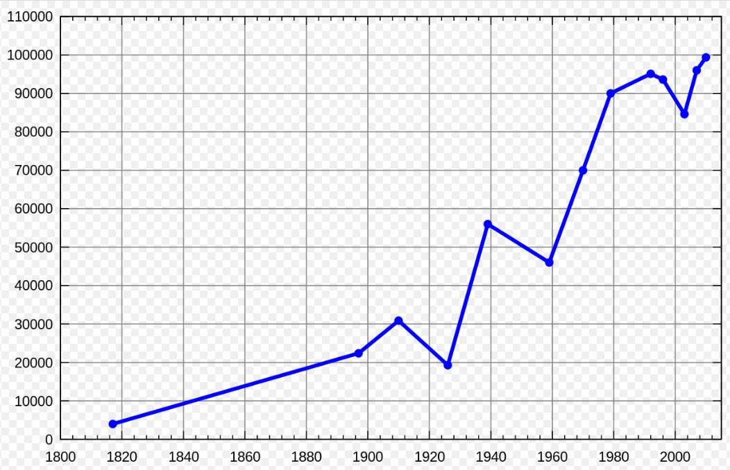
A line graph showing the population of the town of Pushkin, Saint Petersburg from 1800 to 2010, measured at various intervals. By This drawing was created by Artem Topchiy (user Art-top). Other drawings see here – This W3C-unspecified plot was created with Gnuplot., CC BY-SA 3.0, https://commons.wikimedia.org/w/index.php?curid=9931350
Line Graphs
Line graphs are an essential tool for any data visualizer – they show changes in a variable over time, allowing us to interpret trends and compare different datasets. As their name implies, line graphs form a line from one point to the next by connecting individual values that represent a specific category or group of categories.
When interpreting line graphs, it’s important to look at both the shape of the graph as well as its position relative to other lines on the same chart. This allows us to determine if there has been a change in trend over time or if certain variables have outpaced others.
Advantages of Line Graphs
The advantages of using line graphs include
- easy comparison between multiple sets of data and
- simplicity – with only two axes (the x-axis representing time and the y-axis representing value) needed to plot points, these charts require minimal effort when constructing them.
- Line graphs also make it easier for viewers to quickly grasp large amounts of information without having to analyze complex diagrams.
- Additionally, unlike bar charts which can become cluttered and hard to read with too many entries, line graphs remain visually appealing even when displaying numerous groups of data simultaneously.
Applications of Line Graphs
There are numerous applications for line graphs.
- Some common ones include tracking consumer spending habits over time or comparing stock prices across different companies within an industry segment.
- They may also be used to identify seasonal patterns such as peaks in sales during holiday periods or drops in demand during times where customers tend not spend money due to lack of income or decreased purchasing power.
Finally, understanding how different factors interact with each other is made simpler by plotting them onto a single chart so we can observe relationships between multiple variables more easily.
With all this considered, it’s clear why line graphs provide invaluable insights into our analysis – whether we’re looking at historical trends or current market conditions, these visuals allow us see how various elements come together and help inform decisions about what action should be taken going forward.
Bar Graphs
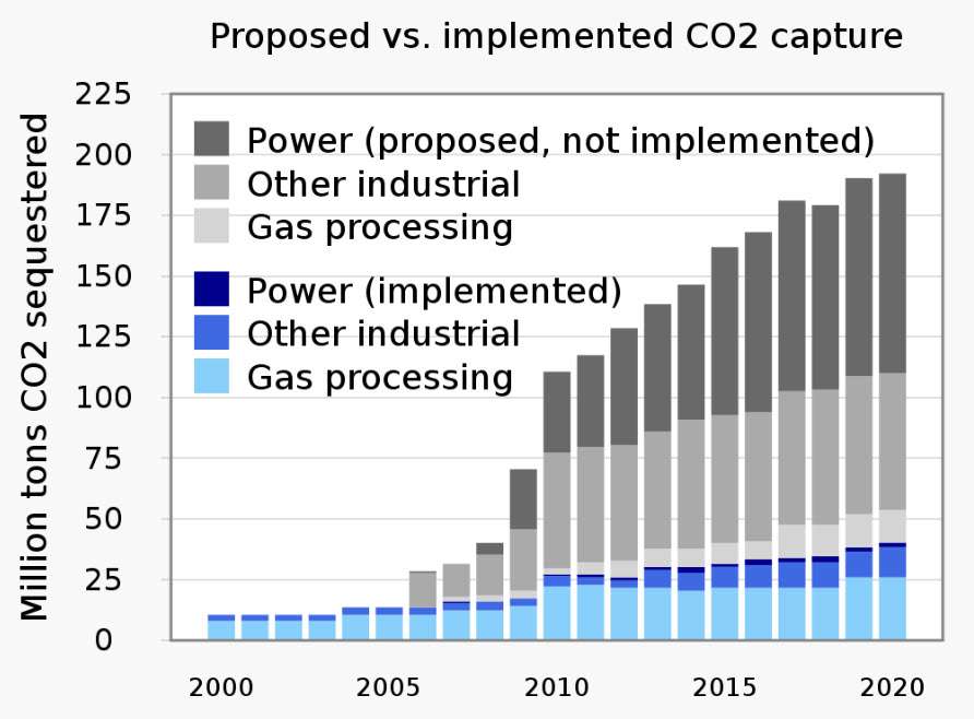
A vertical stacked bar chart with positive values. By RCraig09 – Own work, CC BY-SA 4.0, https://commons.wikimedia.org/w/index.php?curid=103611926
Next, let’s take a look at bar graphs. These are incredibly useful for comparing different sets of data and analyzing trends across multiple groups or categories. With bar graphs, we can easily compare the relative size or value of each category as well as track changes in these values over time.
Bar graphs also allow us to incorporate color coding to further distinguish between various variables and make it easier for viewers to quickly identify patterns within the chart.
Types of Bar Graph
There are several types of bar charts including
- column,
- line-column,
- stacked, and
- diverging – each with their own strengths that make them ideal for certain scenarios.
Columns present individual values side by side while line-column combines features from both columns and lines to show how two datasets interact over time.
Stacked bars provide an effective way of visualizing complex data relationships without overcrowding the chart while diverging bars display differences in performance between two points on a continuous scale such as those used when measuring customer satisfaction levels.
Bar comparisons have many advantages; they’re easy to read yet still contain enough information to be useful for more advanced analysis applications like forecasting future trends or making predictions about customers’ purchasing habits based on past behavior.
Additionally, due to the sheer amount of options available when setting up a graph (including orientation, colors palette selection etc.), users can customize their visuals according to their specific needs which makes this type of chart quite versatile across industries and business functions alike.
In sum, bar graphics offer valuable insights into our data analysis – helping us better understand visualization trends so we can make informed decisions backed by evidence rather than guesswork.
Choosing The Right Graph Or Chart For Your Data
I’m an expert in data visualization, so let me tell you about choosing the right graph or chart for your data.
There are several types of graphs to choose from, so it’s important to consider which one best fits the data you’re trying to visualize.
When it comes to visualizing data, it’s important to think about the message you want to convey. With that in mind, you can then choose the right chart to make your data more effective and understandable.
Finally, don’t forget to think about the audience you’re presenting to – the right chart may vary depending on who you’re presenting to.
Types Of Graphs
When it comes to data visualization, selecting the right graph or chart is key. It’s important to consider the type of data you’re working with and what kind of message you want to convey when choosing a graph. Understanding different types of graphs and which ones are best suited for your purpose can help ensure that your visualization has maximum impact.
Let’s take a look at some of the most common options available:
Different graphs for different purposes
For multi-dimensional datasets, bar charts or line graphs are often used for comparison purposes. They allow us to visualize trends over time or across values more clearly than if we were looking at raw numbers alone.
Additionally, pie charts provide an effective way to compare parts to whole relationships – such as comparing budget allocations across departments in an organization.
Picking the correct graph type helps ensure accuracy in our visualizations. For example, scatter plots should be used when two variables interact with each other; while histograms are useful for analyzing frequency distributions by plotting groups of numerical data on an x-axis against how many times they occur on a y-axis. Knowing which types work well together will ensure better quality visuals overall.
Finally, there are also several techniques you can use to make sure your charts stand out from the crowd – things like color coding categories in column graphs and using animation effects in interactive visuals can really bring them alive!
Utilizing these tools wisely allows us to create meaningful stories through our data visualizations so they reach their full potential.
Visualizing Data
Once you’ve decided on the type of graph or chart that best suits your data, it’s time to get to work visualizing and interpreting it.
To effectively analyze trends within your dataset, try including features such as color coding categories in column graphs or using animation effects in interactive visuals for added impact.
Data presentation should also be considered when working with large datasets; pie charts can provide an effective way to compare parts to whole relationships while scatter plots are great for seeing how two variables interact with each other.
Data storytelling is another key aspect when it comes to data visualization – by utilizing different types of graphs together, we can create meaningful stories through our visuals which highlight patterns and correlations between different pieces of information.
With careful consideration of what you want to convey and creative use of all the tools at your disposal, you can make sure that your data analysis reaches its full potential!
Choosing The Right Chart
Once you have identified the type of graph or chart that is best suited for your data, it’s time to choose which one will work best.
It’s important to consider factors such as interactive graphs, visual hierarchy and data accuracy when selecting a chart; this will help ensure that your final product conveys all the necessary information clearly and accurately.
Additionally, labeling each axis on your graph properly can make it easier for readers to interpret the results quickly.
Finally, using colors and fonts effectively can also add clarity to your visualization by making different elements stand out from each other.
With careful consideration of these details, you’ll be sure to create an effective representation of your data!
Preparing Your Data For Visualization
The types of graphs you use depend on the data you’re analyzing. Data analysis is key to creating effective visuals; you want to make sure you’re getting the most out of your data.
Chart design is also important; it helps communicate your message in a visually appealing way. I always check the data for any anomalies before creating a graph.
I then decide which type of graph best conveys the data. After that, I adjust the design to make sure it’s easy to read and understand.
Finally, I check the data again to make sure the graph is accurate.
Types Of Graphs
When it comes to data visualization, the type of graph you use can make all the difference.
From geographic graphs for mapping out population changes to comparison and comparative graphs that enable interactive exploration, there are a plethora of options at your disposal.
When deciding which one is right for your project, consider what kind of analysis you need to do with the data.
Geographic graphs are great when trying to map out population changes over time or in different locations.
Population graphs help you pinpoint trends related to people’s age, gender, income level, etc., while comparison graphs allow for easier side-by-side comparisons between similar datasets.
Comparative graphs take this concept even further by allowing users to interactively explore multiple layers within large datasets.
And finally, interactive graphs provide an engaging way for users to explore complex correlations among various elements in a dataset.
No matter which type of graph best fits your needs, each provides invaluable insight into how different factors play off against each other — enabling deeper understanding about whatever topic you’re analyzing!
Data Analysis
Once the data sources have been identified and datasets collected, it’s time to move on to data analysis.
This process involves mining, preparing, exploring, and cleaning up your data before you can begin visualizing it.
Data mining helps uncover hidden patterns in the raw information that may prove useful for analysis. It also allows for more efficient use of resources by determining what is relevant or unnecessary.
After this step comes data preparation which includes organizing and formatting the data so that it’s ready for visualization. During this phase, any errors or inconsistencies should be identified and corrected as needed.
Finally, data exploration involves going through your dataset and looking for potential relationships between different elements within the set. By doing this, you can get a better sense of how these elements interact with each other — allowing you to create even more powerful visuals!
Chart Design
Once the data is prepared and ready for visualization, it’s time to move on to chart design.
Chart styling plays a crucial role in creating an effective visual representation of your data that conveys its message accurately. It is important to choose appropriate colors, fonts, text sizes and other elements that create a visually appealing presentation while still maintaining accuracy.
Keep in mind that visuals should be simple yet impactful; too much information can have an adverse effect on the overall look and feel of the chart or graph.
Additionally, data presentation techniques like pie charts, bar graphs, line graphs etc., should be carefully chosen based upon which one best communicates the story behind the numbers.
By taking all these factors into consideration when designing charts you will be able to ensure both accurate data representation as well as strong visual impact.
Creating A Bar Graph
Bar graphs are a great way to visualize data, and they’re quite easy to make.
Let’s start by discussing the basics of bar graphs – what they are, why we use them and when they are most effective.
Then, I’ll show you how to create a bar graph, step-by-step.
You’ll be creating your own bar graphs in no time!
Bar Graph Basics
Bar graphs are a great way to visualize data, and they’re one of the most commonly used forms of visual representations.
To create an effective bar graph, it’s important to understand the basics of defining, comparing, interpreting, creating and analyzing them.
Defining bar graphs is fairly straightforward; put simply, bar graphs represent categorical data using vertical or horizontal bars with lengths proportional to the magnitude of variables being compared. This allows us to easily compare different values between two or more categories.
Comparing bar graphs also requires an understanding of how to interpret them properly; in essence, we must look at both the length and direction (upward vs downward) of each bar in order to make sense out of any given comparison.
Additionally, when creating your own bar graph you should take into account factors such as which type (vertical or horizontal), size and color scheme will best communicate your message accurately.
Finally, when analyzing a bar graph it can be helpful to break down all relevant information into smaller parts so that you can detect patterns over time or identify trends within particular groups. By doing this we can gain valuable insights into our data that would otherwise remain unseen!
Creating A Bar Graph
Creating a bar graph is the next step after defining, comparing and interpreting data.
To do this correctly, you have to understand how each variable is related to one another and then visualize that relationship in the form of a bar chart.
When creating your own bar graph, it’s important to consider factors such as which type (vertical or horizontal), size and color scheme will best communicate your message accurately.
Additionally, when assessing outliers, deciphering relationships between categories or analyzing patterns over time in order to gain valuable insights from your data, having an effective visualization can be immensely helpful!
It’s also good practice to look for trends within particular groups so that you can better identify any hidden correlations.
With all these elements taken into account, you’ll have no problem crafting an informative and impactful bar graph.
Creating A Line Graph
When it comes to designing a line graph, it’s important to consider the purpose of the graph and what message you’re trying to convey.
Additionally, it’s essential to ensure the visual elements, such as colors, fonts, and titles, are clear and concise.
When it comes to interpreting line graphs, it’s important to understand the context of the data being presented, as well as any trends or patterns that may be represented.
With the right tools and knowledge, line graphs can be an effective way to communicate data.
Line Graph Design
Line graphs are one of the most versatile and effective tools for data visualization. They can be used to quickly analyze trends, compare different sets of data, and assess changes over time.
When creating a line graph, it is important to consider certain design elements such as reading data accurately, analyzing trends effectively, customizing the graph according to the needs of your audience, and using reliable sources of information. These components will help ensure that your readers have an easy time understanding the story behind the numbers.
When constructing a line graph, start by gathering accurate data from trusted sources. This includes both qualitative and quantitative information which should be presented in a clear format so that readers can easily understand what they are looking at. To make sure you’re getting valid insights into the underlying patterns within your data, use appropriate analytical techniques like regression analysis or correlation testing.
In addition, when determining how to customize your graph for presentation purposes (e.g., labels, color schemes), take into account any cultural differences among your target audiences or other factors that could influence their interpretation of the visuals. Once these considerations have been addressed, look for ways to draw out meaningful conclusions from your data set with line graphs.
As previously mentioned, this type of chart allows readers to observe changes over time as well as identify correlations between two variables; depending on its complexity level, it may even be possible to spot outliers or anomalies in a dataset more easily than with other types of charts or visualizations. Additionally pay attention to point placement — small discrepancies in positioning can affect viewers’ interpretations of trend lines — and add annotations if needed for further clarification about particular points along each axis.
Ultimately, properly designed line graphs facilitate comprehension and create powerful stories out of otherwise mundane statistics; done correctly they provide an efficient way for people to grasp complex concepts quickly without having prior knowledge about them. Creating one isn’t just about drawing curves but requires thoughtful consideration regarding accuracy and customization based upon who’s going to view it — failure to do so could lead viewers down inaccurate paths while trying to interpret readings off the chart itself!
Interpreting Line Graphs
Interpreting line graphs is just as important as creating them. It requires analyzing trends, comparing values, recognizing patterns, interpreting shapes and identifying correlations. This can help viewers draw meaningful conclusions from the data set and gain insight into changes over time.
To accurately interpret line graphs it’s important to consider how the points are placed on the graph, look for anomalies in the data set, identify any correlations between variables or recognize any relevant patterns that could be present. Additionally, adding annotations can provide further clarification about particular points along each axis which can also assist in understanding the story behind the numbers.
Line graphs offer an efficient way of conveying complex concepts quickly without having prior knowledge. Therefore it’s essential to make sure they’re designed correctly so that readers don’t end up following inaccurate paths when trying to interpret readings off the chart itself!
Creating A Pie Chart
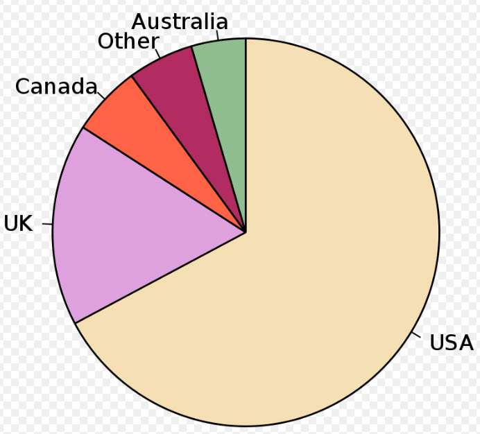
Pie chart of populations of English native speakers. By M. W. Toews – Own work, data from English dialects1997.png, CC BY-SA 4.0, https://commons.wikimedia.org/w/index.php?curid=2377248
Pie Charts are an effective way to visualize data. They represent data in a circular format with each segment representing a percentage of the whole.
When creating a Pie Chart, it’s important to consider the data you want to represent and make sure it’s accurately reflected. Additionally, you’ll want to design your chart to be visually appealing and make sure it effectively communicates the data.
With the right attention to detail, Pie Charts can be an effective way to communicate data.
Pie Chart Basics
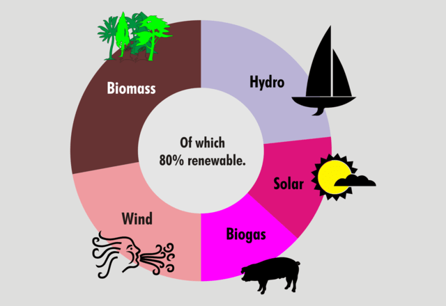
Information on the data as a hole in the center of a doughnut chart. By Boltor at English Wikipedia, CC BY-SA 3.0, https://commons.wikimedia.org/w/index.php?curid=92452719
Pie charts are an invaluable tool for visualizing data and interpreting it accurately. They can help you identify trends, draw conclusions from limited data sources, and make analytical decisions with confidence.
When creating a pie chart, the most important step is to ensure that your data is accurate – this will give you reliable results when analyzing and visualizing information.
To create a pie chart correctly, start by organizing your data into categories or slices according to the type of analysis you’re performing. Once categorized, add up the totals in each category so that all of your numbers are represented accurately on the graph.
It’s also helpful to include labels like percentages or ratios as well as titles and legends if applicable.
When constructing a pie chart, consider using colors that contrast with one another to differentiate between different slices of data. This will make it easier to interpret the graph quickly while ensuring accuracy in terms of which slice has what value associated with it.
Additionally, think about how much space should be allocated for each section; too little may cause confusion about which number belongs where whereas too much could distort any meaningful patterns present in the raw data.
Once complete, assess your work critically before sharing it with others: does everything look right? Are there any discrepancies between values shown on the legend and those listed on the graph itself? Is anything missing or unnecessary?
By taking these steps beforehand, you can rest assured knowing that your audience will have an easy time grasping complex concepts through visually appealing visuals!
Data Representation
Once the data is organized into categories and totals are calculated, it’s time to think about how best to represent that information.
Data representation can make or break the success of a pie chart, so it’s important to pay close attention to this step. For starters, colors should be used strategically for quick recognition; contrasting shades are ideal as they’ll help viewers quickly differentiate between slices of data.
Additionally, consider allocating an appropriate amount of space for each section: too much or too little can lead to misinterpretation and/or distortion of meaningful patterns in your raw data. Labels like percentages or ratios are also great additions since they provide context for what the values signify.
Finally, don’t forget about accuracy when crafting your graph – double check your work before sharing it with others! By performing rigorous data analysis and ensuring quality data integration along with proper security measures, you can ensure that everyone will have an easy time understanding complex concepts through stunning visuals.
Designing Pie Charts
Once you’ve chosen the data to represent, it’s time to start designing your pie chart.
To ensure accuracy when interpreting data, evaluate any sources that may have been used in collecting information and double check all values before visualizing trends.
When selecting colors for each slice of the graph, keep in mind that contrast helps readers quickly differentiate between them; this will help make complex concepts easier to understand.
Additionally, consider how much space is given to each section as too much or too little can distort meaningful patterns found within the data.
Finally, don’t forget about labels like percentages or ratios – these provide context and clarity for viewers who are trying to comprehend what they’re looking at.
Creating A Scatter Plot

Waiting time between eruptions and the duration of the eruption for the Old Faithful Geyser in Yellowstone National Park, Wyoming, USA. This chart suggests there are generally two types of eruptions: short-wait-short-duration, and long-wait-long-duration. Public Domain, https://commons.wikimedia.org/w/index.php?curid=646999
Let’s start with the basics: a scatter plot is used to show the relationship between two variables. They can be used to display correlations, patterns, and trends in data.
There are different types of scatter plots you can use, depending on what information you want to show. For example, there are scatter plots with a third variable plotted as a size, shape, or color, or scatter plots with a third variable as a line.
To make your scatter plot stand out, you can format it using labels, colors, and legends. That way, you can clearly and effectively communicate your data insights.
Scatter Plot Basics
Creating an effective scatter plot is a great way to visualize relationships between two variables. As a data visualization expert, I often use this type of chart for interpreting results and identifying trends.
Scatter plots are also useful when you need to compare different variables or explore the data. For example, if you’re looking at correlations like sales over time or age versus income – scatter plots can help make sense of it all!
To get started with your own scatter plot, start by plotting points on coordinates representing both sets of data. This will create the visual representation that makes it easier to identify any patterns in the data.
Then look for clues such as clusters, linearity or outliers which can give insights into how these two variables interact with each other. With a bit of practice, you’ll be able to see potential relationships quickly and easily using scatter plots – making them invaluable tools in any data analyst toolkit!
Scatter Plot Types
Interpreting scatter plots can be a great way to visualize and analyze relationships between two variables.
There are many types of scatter plot charts available, each offering its own unique advantages when it comes to interpreting correlations or comparing data points.
For example, the bubble chart is useful for recognizing clusters in your data while the line graph allows you to track trends over time more easily.
If you’re looking at multiple datasets, then using dual-axis charts will let you compare them side by side.
Combining different types of graphs can also be beneficial when trying to make sense of complex information.
With practice, I’m sure any data analyst would find these scatter plots extremely helpful in finding patterns in their work!
Formatting Scatter Plots
Once you’ve decided which type of scatter plot to use, it’s time to get formatting!
Formatting your graph correctly can make all the difference when it comes to interpreting and analyzing data.
To begin with, make sure that the axes are labeled properly so everyone knows what information is being presented.
It’s also important to choose colors or symbols carefully – they should be clear enough for viewers to easily distinguish between different points on the graph.
Additionally, consider adding grid lines and a legend if needed.
Lastly, inspect each point in your chart one by one to ensure accuracy; this will help you troubleshoot any discrepancies in your data before presenting it publicly.
With just a few tweaks here and there, anyone can create great-looking scatter plots that are easy to interpret and understand!
Creating A Histogram
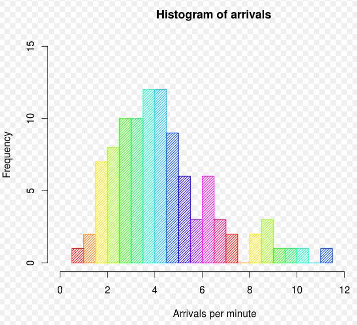
Example histogram, showing frequencies of arrivals per minute. By DanielPenfield – Own work, CC BY-SA 3.0, https://commons.wikimedia.org/w/index.php?curid=9401898
Creating a histogram is a great way to visualize data, so let’s start by discussing what goes into making one.
After that, we’ll talk about how to interpret the histogram once it’s created.
It’s important to understand both the construction and interpretation of a histogram so that you can use this powerful tool to its fullest potential.
Let’s get started!
Creating A Histogram
Creating a histogram is an effective way to visualize data and uncover patterns in the information.
As a data visualization expert, I recommend using this type of chart when it comes to interpreting histograms and comparing them with other charts.
Histograms have many advantages over other types of visualizations because they can quickly show how much of something has happened or what value most often occurred.
Additionally, these charts are useful for understanding distributions within datasets and recognizing outliers.
The limitations of histograms include not being able to compare different categories against each other as easily as you could with bar graphs or pie charts.
However, given their ability to showcase distributions within datasets, they are still one of the best ways to display your data accurately.
All in all, creating a well-designed histogram is an essential part of any data visualization project – so make sure you understand the basics before getting started!
Interpreting Histograms
Interpreting a histogram is an essential step in understanding the data it represents.
As a data visualization expert, I recommend taking some time to analyze the shape of your histogram and compare its distribution with other charts.
By doing so, you can identify trends or outliers that may be useful for further analysis.
Additionally, comparing distributions between different categories can help interpret results more accurately.
Through interpretation of shapes, analyzing outliers, and comparing distributions, you will gain deeper insights into your dataset and have better control over interpreting the results.
All of this makes analyzing a histogram an invaluable skill when creating effective data visualizations.
Creating A Bubble Chart
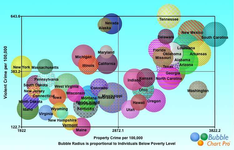
Bubble chart displaying the relationship between poverty and violent and property crime rates by state. Larger bubbles indicate higher percentage of state residents at or below the poverty level. Trend suggests higher crime rates in states with higher percentages of people living below the poverty level. By George Huhn – Own work, CC BY-SA 3.0, https://commons.wikimedia.org/w/index.php?curid=29704841
Creating a bubble chart is an effective way to visualize data in a meaningful way.
It also allows for a comparison between multiple variables at once, making interpretation easier.
Interpreting a bubble chart requires an understanding of the data being represented, as well as the scale of the bubbles relative to each other.
By understanding these elements, one can gain a better understanding of the data and draw meaningful conclusions.
Creating Bubble Chart
Bubble charts are a powerful tool for exploring data, as they help to easily interpret trends and understand relationships between different variables.
As an expert in data visualization, I recommend using bubble charts when you want to manipulate the size of your points relative to other values in order to gain insights from your data analysis.
Bubble chart axes can be configured with any combination of quantitative or categorical variables, allowing you to visualize complex patterns that may not be immediately obvious.
Through careful interpretation of these visuals, it is possible to uncover important correlations and underlying trends that would otherwise remain hidden.
By utilizing bubble charts within their data exploration process, businesses can make more informed decisions based on visualizing meaningful insights from their datasets.
Interpreting Bubble Chart
Once you have established the axes and data points for your bubble chart, it’s time to start interpreting its results.
Through careful analysis of these visuals, you can compare different datasets, explore correlations between variables, identify patterns in the data, and analyze trends.
All of this information can be used to gain valuable insights from your data set and make informed decisions about what course of action should be taken next.
When reading a bubble chart, remember that larger bubbles represent higher values than smaller ones.
This allows you to quickly spot any outliers or anomalies in the data when compared with other points on the graph.
Additionally, looking at how individual bubbles are clustered together will help you interpret any underlying trends within the dataset more easily.
You can also use color-coded labels to further differentiate groups of related bubbles from each other.
Finally, by closely studying all aspects of a bubble chart—from comparing size differences to analyzing colors and shapes—you’ll be able to uncover important relationships between multiple variables that would otherwise remain hidden.
With this knowledge in hand, businesses can then go forward confidently knowing they’ve made their decision based on meaningful insights derived from visualizing their data accurately.
Creating A Heat Map
Heat Maps come in many varieties, from intensity maps to chloropleth maps. It’s important to choose the type that best suits the data you’re working with.
When it comes to colors, the choice should be based on the message you want to convey. Warmer colors are often used to indicate higher values, while cooler colors are used to represent lower values.
The overall design of a heat map should be done with readability and clarity in mind; a clean layout will ensure that the data is easy to interpret.
Heat Map Types
Heat maps are a great way to visualize data, but there are several types of heat map that can be used.
One type is the choropleth map, which uses color-coded regions to represent varying levels of data. This type of heat map can be particularly useful for displaying population density or mapping out political boundaries.
Another type is the proportional symbol map, which uses symbols such as circles and squares with varying sizes to display different amounts of data associated with each location on a map.
Finally, there are dot density maps, which utilize dots placed at various points in order to show the distribution and intensity of certain features across an area.
The advantages of using heat maps include providing quick visual representations of data sets so that patterns and trends can easily be identified. They also provide contextual information by allowing viewers to see how different variables interact within one visualization.
Despite their many benefits, there are some potential pitfalls when creating a heat map – including incorrect interpretation due to too much emphasis being put on color rather than value; this could lead people astray if they don’t understand why colors have been chosen in the first place! Additionally, it’s important for designers to take into account any existing biases when interpreting these visuals so that accurate conclusions can be drawn from them.
Heat maps can be applied in all kinds of contexts – from medical research projects examining disease outbreaks to economic studies exploring poverty levels or analyzing consumer spending habits.
When designing your own heat maps, keep accessibility in mind: make sure you use clear labeling and avoid making assumptions about who might view your work! Additionally, consider what other formats would best fit your needs before settling on a specific heat map style – remember that some may be more appropriate than others depending upon the nature of your project’s content and goals.
Finally, embrace modern technology tools like interactive webmaps which enable users to explore multiple layers simultaneously; this allows for even greater insights into complex datasets!
Heat Map trends indicate that we will continue seeing new ways in which creators employ them for both personal and professional purposes alike. So whether you’re working on tackling global climate change or researching local crime rates – get creative with your designs and find innovative solutions through data visualization today!
Heat Map Colors
When creating a heat map, it is important to consider the syntax of your color scheme.
Color theory and symbolism can be used to determine what type of message you are trying to convey with your visualizations.
Additionally, there are various mapping techniques that should be taken into consideration when choosing palettes – such as gradients for gradual changes or categorical colors if you want to highlight distinct categories.
It’s also essential to use accessible and understandable hues so viewers don’t get confused by any patterns they may find in the data.
Ultimately, the right combination of these elements will help ensure that both accuracy and clarity are achieved in your heat maps.
Heat Map Design
Heat map design is a critical component to heat map creation.
When designing your heat map, you need to consider the data aggregation that will be used and how it can best represent the data analysis.
This requires careful selection of appropriate heat map colors in order to effectively convey the message without being too overwhelming or distracting for viewers.
Additionally, color theory and symbolism should also be taken into account as they help communicate more than just numbers on a page.
With all these elements combined, you’re sure to create an effective, accurate, and informative heat map that will accurately illustrate your data set with clarity.
Creating A Radar Chart

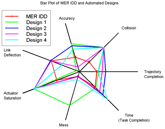
Example star plot from NASA, with some of the most desirable design results represented in the center. By NASA Primary START – Automation Tool for Rapid Design of Space Systems, Public Domain, https://commons.wikimedia.org/w/index.php?curid=4994717
Radar charts are an effective way to visualize data, so understanding their components is key.
The chart is composed of multiple axes, each representing a different variable, which are connected to form a star-like shape.
To create a radar chart, start by deciding which variables to include, then organize the data in a table.
Next, plot the data points on each axis and join them up to form the chart.
When interpreting the data, it’s important to note the relative position of each point compared to the others.
With proper use, radar charts can be powerful tools for data visualization.
Radar Chart Components
Creating a radar chart is an important step for any data visualization project.
Radar Chart components, such as types of charts and comparison, are essential to consider when building out your chart’s design.
Different types of radar charts can help you compare several items more accurately with the use of multiple axes – making it perfect for comparisons between different categories or attributes.
Furthermore, designing your own custom chart has never been easier – allowing you to make sure that all data points are accurate and represented correctly in the final product.
Additionally, radial charts have various applications including marketing campaigns, portfolio diversification analysis, risk assessment, and customer segmentation.
Knowing how each component works together will ensure that your radar chart reflects the desired outcomes from your research project.
With careful consideration of these components before creating a radar chart, we can be sure to present our data efficiently and effectively!
Constructing A Radar Chart
Once you have completed the design of your radar chart, it’s time to start interpreting the results.
Advantages of using a radar chart include exploring applications such as marketing campaigns and customer segmentation with ease. Additionally, you can compare different types of charts to discover which one best suits your needs when visualizing data.
When constructing a radar chart, it is important to consider any potential limitations that may affect its accuracy or effectiveness in order to draw reliable conclusions from the data presented. With careful consideration of all components involved, we can be sure to make informed decisions based on accurate representations of our research data!
Interpretation Of Radar Chart Data
By customizing radar charts, we can begin to analyze the patterns of data in order to gain various insights. These insights can be invaluable for marketers and researchers alike, as they help us better understand our customer base or target audience.
Additionally, the advantages of using a radar chart extend beyond just visualizing the data but also allow us to draw meaningful conclusions from it. With this ability comes greater potential for finding solutions that are tailored specifically to our business needs.
When analyzing the data presented in a radar chart, it is important to consider any limitations that could affect its accuracy or effectiveness. This includes factors such as outliers and discrepancies in statistical measurements which may skew results if not properly accounted for when interpreting your findings.
While there will always be some degree of uncertainty when dealing with analytics, careful consideration of all components involved can ensure reliable outcomes when drawing conclusions from your data visualization project.
In conclusion, understanding how to interpret radar chart data is an essential skill set for anyone looking to maximize their use of graphs and visuals within their research projects. By combining the power of customized designs with accurate analysis techniques, you’ll be able to unlock valuable insights into your customers’ behaviors and preferences – leading you closer towards making informed decisions based on real-time data!
Creating A Box Plot
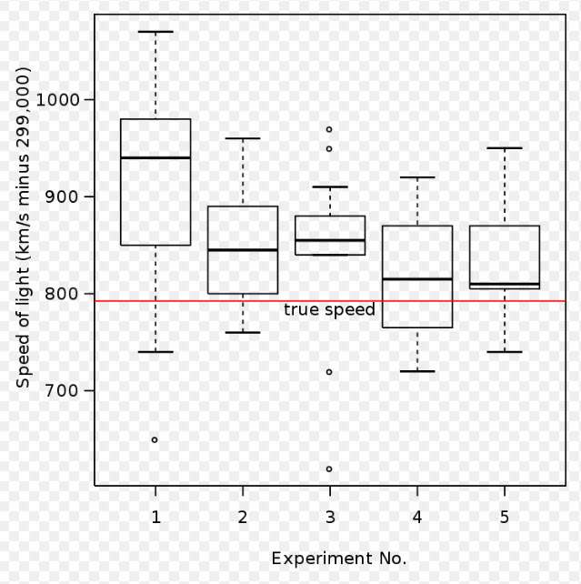
Box plot of data from the Michelson experiment. By User:Schutz – Own work, Public Domain, https://commons.wikimedia.org/w/index.php?curid=1501411
Interpreting Box Plots is key to understanding the underlying data; they provide a way to quickly visualize the spread and distribution of data. Box Plots can also help us detect outliers, which can help identify potential data issues.
Building Box Plots is relatively straightforward; we need to find the median, the quartiles, and the min and max values of our dataset. Knowing how to construct, read, and interpret Box Plots is an important part of data visualization; it’s a great way to quickly understand the trends in our data.
Interpreting Box Plots
Interpreting box plots is a critical component of understanding data visualizations.
Box plot shapes tell us a great deal about the distributions within our data sets, and it’s essential to be able to accurately interpret quartiles when analyzing outliers or skewness.
To do this effectively, we must look for patterns in our data that may not be immediately visible – such as gaps between values or clusters which can affect the shape of our box plot.
Understanding how these patterns are related to one another gives us an invaluable insight into the underlying structure of our data set.
For instance, if there are large amounts of outliers on either side of the median, then this could indicate a skewed distribution which might require further analysis.
Furthermore, by interpreting the shape of our box plot correctly, we can identify trends across different datasets and make more informed decisions based on the information presented.
By leveraging these insights provided by box plots, we have greater control over managing risks associated with any given dataset.
In short, knowing how to read and interpret box plots is vital for anyone wishing to better understand their data visualizations and use them to their advantage.
Box Plot Constructions
Once you have a good grasp on interpreting box plots, the next step is to start exploring how they are constructed.
By understanding the different components of box plots – such as quartiles and outliers – we can begin to compare one plot against another for further analysis. This allows us to identify any patterns or trends between our datasets which may not be immediately visible in the visualizations themselves.
Additionally, by comparing multiple box plots side-by-side, it’s easier to spot outliers that exist within each data set and understand their impact on other values. With this knowledge, we can make more informed decisions when analyzing our data sets.
All these factors combined ultimately allow us to gain greater control over managing risks associated with any given dataset – making sure that no surprises arise from unexpected results. In short, mastering the art of constructing box plots gives us an invaluable tool in better understanding our data visualizations.
Creating A Flow Chart
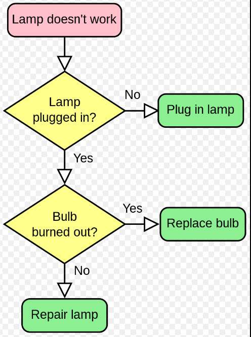
A simple flowchart representing a process for dealing with a non-functioning lamp.. By svg by Booyabazookaoriginal png by Wapcaplet – vector version of Image:LampFlowchart.png, CC BY-SA 3.0, https://commons.wikimedia.org/w/index.php?curid=714537
I’m a big fan of flow charts for data visualization; there are so many types you can use, from process flow charts to organizational charts.
Knowing the different symbols and elements to use in your flow charts is key, from the diamond shape for decision points to the parallelogram for input and output.
Creating a flow chart is really easy once you understand the basics; it’s all about connecting the symbols together in the right way. Plus, there’s lots of software out there designed specifically to make this process easier.
Flow Chart Types
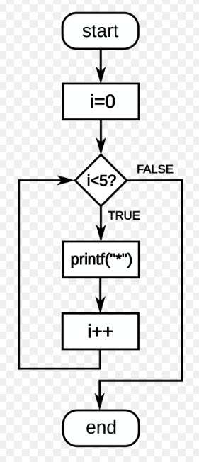
Flow diagram a C-style for loop, representing the following code: for(i=0;i<5;i++) printf(“*”); The loop will cause five asterisks to be printed. By Giacomo Alessandroni – File:For-loop-diagram.svg, CC BY-SA 4.0, https://commons.wikimedia.org/w/index.php?curid=128811834
When it comes to data visualization, flow charts are a great way to visually demonstrate the sequence of events or processes.
Flow chart types such as process diagrams and hierarchical diagrams can help you represent complex relationships between various data sources in an easy-to-understand format.
By using interactive graphs like bubble diagrams, heat maps and tree maps, you can compare different datasets with each other for a better understanding of your results.
Furthermore, employing basic principles of chart design will ensure that your visuals have maximum impact on viewers while maintaining accuracy in the data representation.
In addition, by incorporating visual elements like color coding into your flowchart designs helps make comparisons easier and more effective.
With all these aspects taken care of, creating powerful flowcharts becomes relatively simple!
Flow Chart Symbols
When it comes to flow chart symbols, they are essential for interpreting trends and data accuracy.
By using the right symbols in a flowchart, you can identify key patterns in your results and analyze them more effectively.
Additionally, utilizing comparison methods like color coding makes analyzing different datasets easier, allowing viewers to get an overall understanding of the information quickly.
Visual elements such as arrows also help create relationships between various data sources while keeping the diagram easy to read and interpret.
With these tools at our disposal, we can easily represent complex processes with accurate visuals that clearly communicate the message!
Creating Flow Charts
Creating flow charts is an invaluable tool for data visualization.
By identifying trends and relating data, we can better analyze patterns and interpret results.
From evaluating outcomes to creating visuals that clearly communicate the message, flowcharts provide a powerful way of representing complex processes while accurately visualizing information.
This makes it simpler to understand large datasets quickly by condensing them into one diagram – without needing to come up with a conclusion!
Creating A Tree Map
Tree maps are an effective way to quickly visualize data. They use size and color to illustrate the different components within a given dataset. Understanding the components of a tree map is key to using them effectively.
Also important is recognizing the wide range of applications tree maps can have. From helping to illustrate market share to displaying geographical data, tree maps can be used to quickly and efficiently represent data in a visual way.
Additionally, tree maps provide advantages such as providing quick and simple comparisons and having the ability to be interactive. With this knowledge, tree maps can be used to maximize data visualization potential.
Tree Map Components
Do you need to create an interactive tree map? You’ve come to the right place! Tree maps are a great way to visualize data in an intuitive and attractive manner. They allow users to interact with their data more effectively compared to traditional graphs or charts.
There are several components that go into creating a successful tree map, but we will focus on four of them: treemap design, colors, examples, and advantages.
The design of your treemap is crucial for making sure it’s easy to interpret for your viewers. It can be helpful to use rectangular boxes when designing your tree map as they provide uniformity throughout the graph which helps emphasize hierarchy amongst different groups within the data set. Additionally, using elements like labels and legends can aid in adding clarity for those viewing the tree map by providing context about what each color or shape represents.
Using appropriate colors is also important while creating a tree map as it allows viewers to easily distinguish between different categories within the data set at first glance. When selecting colors it’s best practice to avoid anything too bright or distracting since this could take away from understanding key insights hidden within the data set itself. Instead opt for softer shades that work together harmoniously so not one element stands out too much over another; this ensures all aspects of your chart have equal importance when being examined.
Lastly, taking advantage of existing examples can help inform how effective tree maps should look like before actually starting the creation process yourself; there are plenty of resources available online showcasing various types of creative implementations of tree maps across multiple industries such as finance and healthcare among others providing a wealth of inspiration for anyone looking to make their own unique visualization.
By utilizing these techniques properly during the design phase, you’ll be able produce visually appealing yet informative displays that accurately convey complex information quickly and efficiently without sacrificing readability or user experience – something everyone’s bound to appreciate!
Tree Map Applications
Tree maps are incredibly versatile and have a wide range of applications in any field that requires data exploration. Whether it’s for contextual analysis, comparison metrics, clustering techniques, or predictive modeling; tree maps provide an easy way to view complex information in an attractive manner.
The ability to customize the layout makes them especially useful when there is a need for detailed visual representation such as comparing multiple variables at once. By utilizing different colors and shapes to represent distinct categories within the data set, viewers can rapidly glean insights into how certain elements interact with each other without having to spend time deciphering large amounts of numerical values.
In addition, tree maps offer powerful analytics capabilities that go beyond simple visualization by giving users access to more granular details about the underlying relationships between their datasets. This allows individuals to quickly identify trends and anomalies so they can make informed decisions faster than ever before.
Additionally, since tree maps allow users to drill down deeper into specific parts of their data sets they also provide valuable context which further enhances understanding and aids in decision making processes overall.
Overall tree maps provide an effective solution for anyone looking to explore their data visually while still being able to draw meaningful conclusions from it quickly and efficiently; all you have to do is select your design components carefully before beginning the creation process!
With creative implementations becoming increasingly popular across various industries, now’s definitely the right time start taking advantage of this amazing tool if you haven’t already done so – you won’t regret it!
Tree Map Advantages
Tree maps come with a few key advantages that make them stand out from other data visualization tools. One of the defining characteristics is their ability to compare different sets of information in one consolidated view, which allows users to get an overview of how multiple variables interact without needing to study each separately.
Additionally, they are highly customizable and can be designed according to specific user requirements – making it easier for viewers to visualize complex patterns or relationships within the data set. Moreover, since tree maps can also reveal individual elements of interest quickly; this makes them very useful when exploring large datasets where otherwise small trends may not have been detected.
On top of being able to provide contextual analysis and comparison metrics however, there are some limitations associated with creating a tree map as well. For instance, depending on the complexity of the data set, it may become difficult for users to track specific details or identify outliers due to the lack of granular detail available at any given moment.
Furthermore, because tree maps use colors and shapes differently than traditional charts – there’s always a risk that certain features might be overlooked if used improperly.
Despite these potential drawbacks though; tree maps remain popular among both casual and professional data explorers alike thanks in part to their wide range of applications in various fields such as marketing research, financial planning, medical analytics, and more. By using creative designs coupled with thoughtful implementation strategies; organizations can leverage tree maps as powerful decision making aids while still minimizing time spent on analyzing immense amounts of numerical values.
So whether you’re looking for an easy way to compare multiple variables at once or seeking insights into larger datasets; consider utilizing tree maps for your next project – you won’t regret it!
Creating A Sankey Diagram
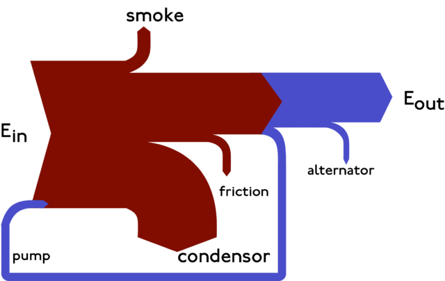
Example of a Sankey diagram. CC BY-SA 3.0, https://commons.wikimedia.org/w/index.php?curid=1394862
Let’s start with some basics – a Sankey diagram is a visualization tool that can be used to show the flow of data from one point to the next. It’s a great way to illustrate how different sources of data are related.
Now, let’s move on to creating a Sankey diagram. It’s not hard, but there are a few steps you need to follow. First, you’ll need to identify the data sources and their relationships. Then, you’ll need to create the diagram with the appropriate visual elements. Finally, you’ll need to label the nodes and flow lines to make sure everything is clear.
Finally, let’s have a look at some examples of Sankey diagrams. From simple diagrams showing the flow of energy, to more complex diagrams with multiple data sources, Sankey diagrams can be used to visually represent a wide range of data flows.
Sankey Diagram Basics
When it comes to data visualization, Sankey diagrams are an invaluable tool. With their unique design and features, they can help you understand complex relationships between different sets of data quickly and easily.
So what exactly is a Sankey diagram? It’s essentially a flow chart that uses arrows to illustrate the movement of items or information from one source to another. In terms of applications, these diagrams are commonly used by transportation planners and energy auditors due to their ability to show the direction of flows within a system.
Sankey diagrams offer tremendous benefits in terms of visualizing complex datasets or tracking the progress of projects over time; however, there are some limitations which should be taken into consideration before using them for your own project.
Firstly, since these diagrams rely heavily on visual cues such as colors and shapes, they may not be suitable for colorblind individuals or those with impaired vision. Secondly, while Sankey diagrams can represent multiple variables simultaneously, they tend to become cluttered when too many elements are added at once – so it’s important to carefully consider your layout beforehand.
Creating a successful Sankey diagram requires careful thought and planning ahead of time. To ensure optimal results, designers need to pay attention to details like arrow thicknesses – which should vary depending on relative sizes – as well as font size/style choices and labeling conventions.
Additionally, other design elements such as line breaks can make all the difference when creating an effective graph whereas ignoring them could lead to confusion or misinterpretation among viewers.
Overall then, Sankey diagrams present powerful opportunities for representing complex systems through simple visuals – but only if implemented properly! By taking into account factors such as user needs, accessibility requirements and overall layout considerations during the initial design phase you’ll be able maximize the potential of this type of data visualization technique for any given scenario.
Creating A Sankey Diagram
Creating a Sankey diagram is a great way to visually represent complex systems and track the progress of projects over time.
It’s important to remember that it requires careful thought and planning, so you can get the most out of this powerful data visualization tool.
This means taking into account user needs, accessibility requirements, font size/style choices and labeling conventions when designing your graph.
Additionally, interpreting results from your Sankey strengths chart correctly will help give valuable insights into your data interpretations.
Visualizing complexity in this manner allows for more accurate data insights than other types of charts or graphs, making it an invaluable asset to any project.
With all these considerations taken into account, creating a well-designed Sankey diagram can prove invaluable in understanding complex relationships between different sets of data quickly and easily.
Examples Of Sankey Diagrams
Now that we understand the importance of thoughtful planning and design for creating effective Sankey diagrams, let’s take a look at some examples.
There are many different types of data visualizations available when it comes to interpreting data, but few can match the level of visual clarity or accuracy provided by this type of graph. From depicting complex systems to tracking project progress over time, Sankey diagrams provide an invaluable asset in data analysis and storytelling.
By looking at various real-world examples, you can get a better idea of how these powerful visuals help display relationships between multiple datasets quickly and easily.
For example, one popular use case is website analytics which traces user behavior from start to finish through a series of steps. Other use cases include financial reporting such as budget allocations or sales performance review – all while displaying intricate details with ease.
These examples demonstrate just how useful Sankey diagrams can be when it comes to capturing key insights from your data sets. By leveraging its unique style, users can gain valuable information within seconds that would normally require hours worth of manual calculations and analyses.
As you can see, there are countless ways to utilize this impressive tool for both personal and professional projects alike!
Creating A Pareto Chart
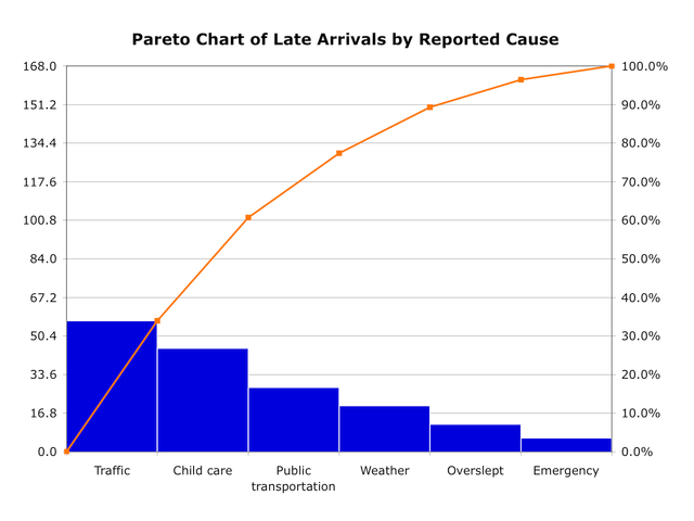
Simple example of a Pareto chart using hypothetical data showing the relative frequency of reasons for arriving late at work. By Metacomet at English Wikipedia – Transferred from en.wikipedia to Commons by Common Good using CommonsHelper., Public Domain, https://commons.wikimedia.org/w/index.php?curid=6199854
Using a Pareto Chart has many benefits; it can help you quickly identify the most significant problems or issues in a data set.
It’s a great way to visualize data, making it easier to draw insights.
Generating a Pareto Chart is relatively straightforward; you’ll just need to know the data you’re working with and the right software to get started.
I’m excited to show you how to use these powerful graphs to your advantage!
Benefits Of Pareto Charts
Pareto charts are a great way to visualize data and analyze results.
As an expert in the field of data visualization, I find that Pareto charts provide a unique opportunity to compare different sets of data while measuring performance and identifying trends.
When you create a Pareto chart, you can easily spot correlations between variables by comparing various metrics over time or against each other. This allows you to better understand how your data is related, making it easier to draw conclusions about your analysis.
By using this type of graph, you can also quickly identify which values have the most impact on overall performance – giving you an edge when analyzing your results.
With a Pareto chart, you can clearly see what changes need to be made in order for improvement. Ultimately, creating these graphs offers an effective way to make informed decisions based off of accurate visualizations.
Generating A Pareto Chart
Generating a Pareto chart is an essential step in the data visualization process. By creating this type of graph, you can accurately interpret and analyze your data to gain valuable insights.
With its advantages such as clear visuals and easy-to-understand metrics, it’s no wonder why many professionals use Pareto charts for their data analysis needs.
The ability to quickly identify correlations between variables makes generating a Pareto chart incredibly useful. This helps ensure that your data accuracy is on point – allowing you to make more informed decisions based on accurate visualizations.
Additionally, with Pareto applications becoming increasingly popular, there are plenty of ways to explore different types of graphs or even create custom ones for specific purposes.
Overall, creating a Pareto chart offers numerous benefits when it comes to interpreting data and understanding the overall trends related to it. Not only does it provide an effective way to compare various sets of information side by side, but also allows you to spot any discrepancies that may exist within the same set of results.
Ultimately, these advantages offer great potential in helping us better understand our data patterns and draw meaningful conclusions from them.
In short, using a Pareto chart can be extremely useful for analyzing performance, identifying trends, and making informed decisions about how best to utilize available resources – all while maintaining high levels of accuracy in the process!
Creating A Gantt Chart
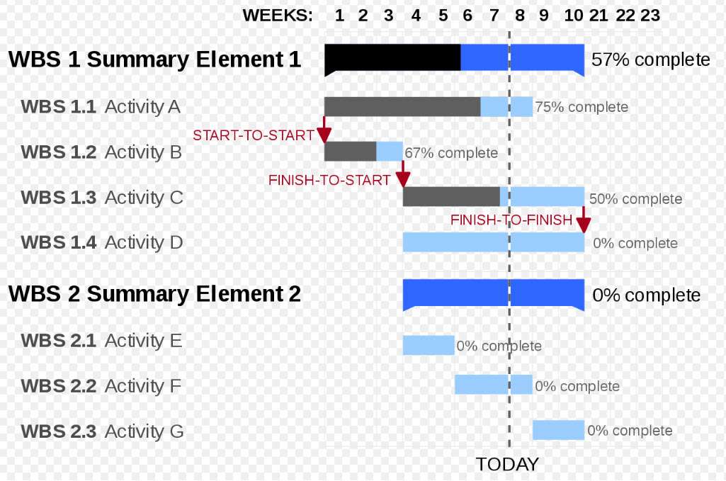
A Gantt chart showing three kinds of schedule dependencies (in red) and percent complete indications. By GanttChartAnatomy.png: Original uploader was Garrybooker at en.wikipediaLater versions were uploaded by Abdull at en.wikipedia.derivative work: Malyszkz (talk) – GanttChartAnatomy.png, Public Domain, https://commons.wikimedia.org/w/index.php?curid=15018988
Before we dive into the details of creating a Gantt chart, let’s review the basics.
I’ll explain the types of Gantt charts and how to use them. Then, we’ll get into the nitty-gritty of creating one.
Knowing the different types of Gantt charts will help you decide which one to use for your project. They can range from basic to complex, so let’s figure out what works best for you.
Gantt Chart Basics
Gantt charts have quickly become one of the most popular tools for data visualization. Their benefits, such as providing a clear timeline and helping to organize complex tasks and projects, make them an invaluable part of any project manager’s toolkit. However, there are some drawbacks to using gantt charts that should be taken into consideration before creating one.
Let’s take a look at the basics of gantt charting!
One of the primary benefits of gantt charting is its ability to clearly illustrate how long each task will take in comparison to other tasks within your project. This makes it easy to identify potential delays or issues that may arise during completion.
Gantt charts also provide a visual representation of which tasks need to be completed first in order to ensure success. With this information readily available, you can create a more efficient workflow and better manage time constraints on your team members or resources.
However, when using gantt charts it is important to remember they come with some limitations too. For example, if you change course while working on a project then you may find yourself having to rework all aspects of your chart – sometimes without warning – making it difficult to track progress accurately over time.
Additionally, because these charts often display large amounts of information at once, smaller details can get lost in the mix making it hard for those unfamiliar with the project or process understand what’s happening without additional explanation or context from outside sources.
To help prevent problems with accuracy along the way it is best practice to use specialized software program like Microsoft Project or TeamGannt when creating a gantt chart so that updates can be made quickly and easily whenever necessary.
It is also beneficial to include milestones throughout your timeline so that everyone involved knows where you stand compared against expected results; this helps keep motivation high even when unexpected challenges crop up along the journey.
By understanding all elements associated with gantt charting – both positives and negatives – you’ll be well equipped for successful data visualization projects every single time!
Types Of Gantt Charts

A Gantt chart created using Microsoft Project. Note (1) the critical path is in red, (2) the slack is the black lines connected to non-critical activities, (3) since Saturday and Sunday are not work days and are thus excluded from the schedule, some bars on the Gantt chart are longer if they cut through a weekend. By Dbsheajr at the English-language Wikipedia, CC BY-SA 3.0, https://commons.wikimedia.org/w/index.php?curid=77392062
Gantt charts come in many shapes and sizes, allowing for a variety of uses. From the basic bar chart to more complex project management models, there’s sure to be one that fits your needs. That being said, it helps to understand what kind of benefits each type offers before you decide which is best for you.
For instance, some Gantt charts provide an easier way to visualize tasks and progress over time than others. Others are better suited for tracking resource usage or presenting interdependencies between tasks. Furthermore, certain types may even offer advanced features like alerting when deadlines are approaching or color-coding schedules by department.
No matter which type of Gantt chart you choose, understanding its capabilities can help make data visualization simpler and faster.
Of course, no tool is perfect; Gantt charts also have their limitations. Some require manual updates whenever changes occur – making them less reliable than automated solutions – while others lack detailed information about task duration or dependencies between tasks.
Additionally, because these tools often display large amounts of information at once, smaller details can get lost in the mix making it hard for those unfamiliar with the project or process understand what’s happening without additional explanation or context from outside sources.
Despite these drawbacks though, using gantt charts still remains a great way to improve productivity and communication within teams and organizations alike – particularly if they’re used alongside other visuals like pie charts or line graphs.
By combining different forms of data visualizations together users can gain insights into their projects quickly and accurately as well as catch potential problems early on in the development cycle.
In short: don’t let the potential downsides stop you from taking advantage of this powerful tool!
Creating A Word Cloud
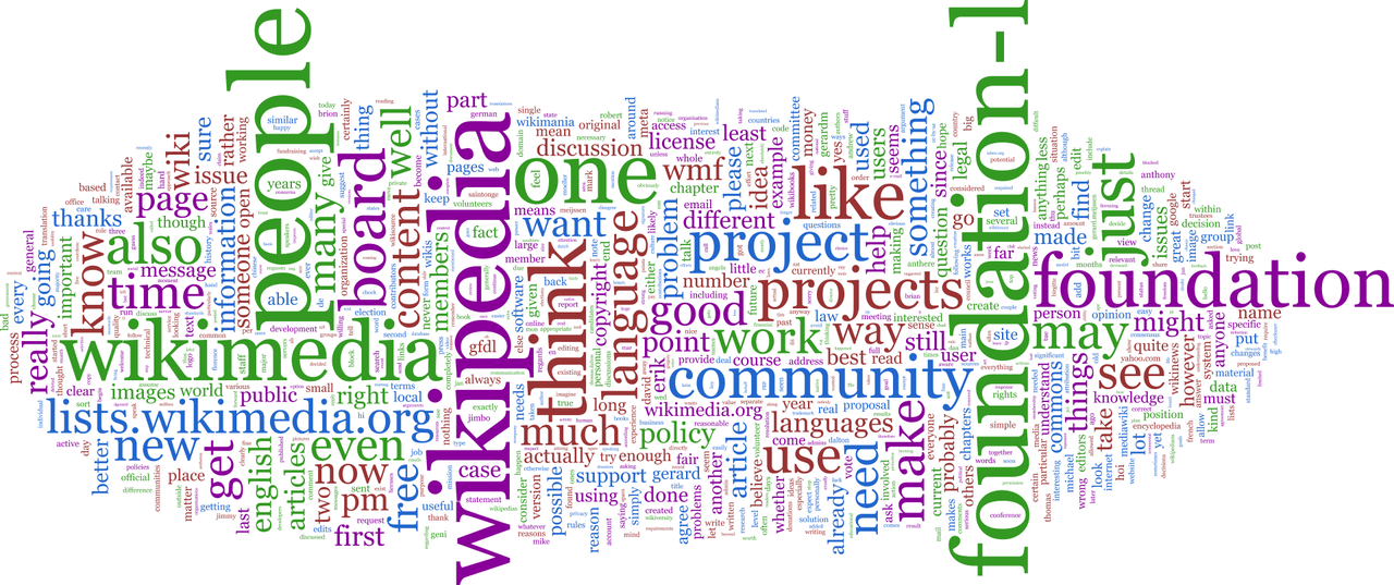
Word cloud of a mailing list. By In2thats12 – Own work, Public Domain, https://commons.wikimedia.org/w/index.php?curid=11694892
Word Clouds provide a great way to visualize text analysis and generate an image quickly.
With font selection, color palettes, layout design, and customization, they can be used to great effect for data visualization.
Tag clouds, data analysis, layout formatting, and word frequency can be used to uncover trends in the data.
Lastly, font size, color schemes, and layout formatting can be adjusted to enhance the visualization.
Word Clouds
Word clouds are an increasingly popular form of data visualization, and for good reason. They offer a dynamic way to display information in a more visually appealing manner than other forms of representation.
Word cloud trends show that they have been used by businesses, journalists, teachers and even designers looking for creative ways to present their data. There is no limit to the styles of word clouds that can be created; from basic shapes such as circles or rectangles to intricate patterns featuring animals or symbols.
The applications for these powerful visualizations are also incredibly varied: using them to get insights into customer behavior, analyzing text-heavy documents quickly, or showcasing your brand’s message.
With all this potential at hand, it’s important to take into account design principles when creating word clouds so they effectively capture attention and communicate complex concepts clearly. By combining different fonts, colors, sizes and shapes you can create unique visuals that will engage any audience—no matter the context!
Text Analysis
Once you’ve created your word cloud, the next step is to analyze the text. This process of ‘text mining’ can be used to uncover insights about what people are saying and how they feel about a certain topic—a technique known as sentiment analysis.
Through data extraction techniques such as language processing and keyword extraction, it’s possible to gain valuable insight into user behavior or customer feedback quickly and easily.
The goal of text analysis is to understand the underlying trends in large amounts of unstructured content so that actionable decisions can be made. By leveraging powerful algorithms for analyzing meaning from natural language, businesses can spot patterns within conversations that would otherwise go unnoticed without significant manual effort.
Additionally, these approaches also enable companies to identify opportunities for improvement by pinpointing areas where customer satisfaction could be improved upon or identifying potential new markets to explore.
By combining different fonts, colors, sizes and shapes with text analytics techniques like sentiment analysis and data extraction, businesses have at their disposal an effective way of interpreting complex concepts swiftly while still engaging any audience visually. Whether you’re trying to get insights into customer behavior or creating visuals for marketing purposes, having access to both design principles and advanced analytical methods will give you better results than either one alone!
Creating A Choropleth Map
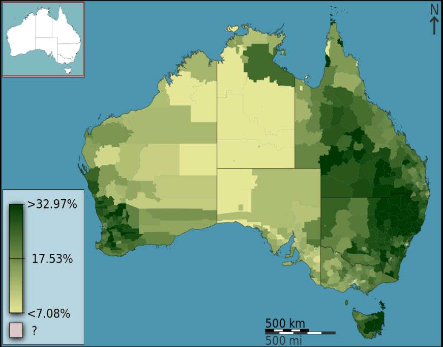
A choropleth map that visualizes the fraction of Australians that identified as Anglican at the 2011 census. The selected districts are local government areas, the variable is spatially intensive (a proportion) which is unclassed, and a part-spectral sequential color scheme is used. By Toby Hudson based on data from the Australian Bureau of Statistics, CC BY-SA 3.0 au, https://commons.wikimedia.org/w/index.php?curid=27035177
Data Preparation is key when creating a Choropleth Map, so that the data can be accurately represented and visualized.
Data Visualization is also very important to consider, as it can help viewers to interpret data effectively.
Map Design is also a crucial component, as it can help to determine how data is represented geographically.
Color Coding can be used to represent data and help viewers to quickly interpret the information.
Geographical representation is key to creating a Choropleth Map, as it allows viewers to visually see the data on a map.
Finally, Analyzing Data is a great way to uncover potential trends and patterns when creating a Choropleth Map.
Data Preparation
Data preparation is an essential step when creating a choropleth map. Before diving into data analysis and exploration, it’s important to make sure the data is clean and organized for accurate visualizations.
This means cleaning up any incorrect or incomplete information, manipulating datasets if needed, and transforming them into useful formats. Data cleaning can help eliminate outliers that may hinder your analysis, while data manipulation ensures all relevant variables are included in the visualization.
Additionally, data transformation helps convert raw data into meaningful forms such as tables and graphs which will be easier to interpret during the exploratory process. All of these steps are necessary before drawing conclusions from our maps – mistakes in preparing the data could lead to wrong interpretations of our findings!
Ultimately, with careful preprocessing we ensure that our results accurately reflect reality so that decision makers have reliable insights at their disposal.
Data Visualization
Once the data has been preprocessed, it’s time to move onto data visualization.
By utilizing graphs and charts like bar graphs, line graphs, histograms, scatterplots and pie charts we can explore trends in our datasets while comparing variables side-by-side.
Visualizing our results helps us analyze patterns more effectively than just looking at raw numbers on a spreadsheet.
Moreover, interpreting these results is much easier when represented graphically; for example by visualizing correlations between two or more sets of data points.
With this powerful tool we’re able to gain valuable insights into our choropleth maps which will aid decision makers in making informed decisions without relying purely on intuition.
In short, effective use of data visualization allows us to compare datasets quickly and accurately so that we can ensure accuracy in our results and draw meaningful conclusions from our analysis.
Map Design
Once we’ve determined the format of our graph, it’s time to move onto map design.
Now that our data is preprocessed and visualized effectively, it’s important to think about how best to represent this information on a choropleth map.
In order to create an effective representation, geospatial analysis needs to be conducted using satellite imagery and terrain mapping combined with data integration from multiple sources for creating basemaps.
This allows us to properly integrate all relevant datasets into one cohesive display so that decision makers can interpret the results accurately.
By carefully selecting colors, labels, fonts and other design elements we can ensure the message behind the visualization resonates with viewers while providing useful insights in an aesthetically pleasing manner.
It’s also helpful to consider adding additional layers such as borders or population density which will help provide more context around the visualization.
Overall, understanding how different elements interact within a given area helps us make better decisions by enabling accurate presentations of complex datasets through powerful tools like maps and graphs.
Creating A Marimekko Chart
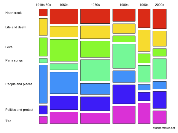
Mosaic plot (or Marimekko Chart) showing cross-sectional distribution through time of different musical themes in the Guardian’s list of “1000 songs to hear before you die”. By Seancarmody – Own work, CC BY-SA 3.0, https://commons.wikimedia.org/w/index.php?curid=7389833
Let’s start by defining what a Marimekko Chart is – it’s a type of stacked bar graph that uses proportional area to represent differences in data sets.
To create and interpret one, you’ll need to calculate the proportions of each segment, then plot them using the height and width of the bars.
The benefits of a Marimekko Chart are that it provides a clearer understanding of the data sets than a regular bar graph, as it takes into account the size of the segments. Plus, it’s visually attractive and easily understood by most people.
So, if you’re looking to get the most out of your data visualization, a Marimekko Chart is a great choice.
Define Marimekko Chart
We all know that data visualization is a powerful tool for understanding and communicating insights. One of the most versatile types of visualizations is the Marimekko chart, which has become increasingly popular in recent years. Understanding what this type of chart is and how to create one can be incredibly useful when it comes to making sense of complex datasets.
A Marimekko chart combines both bar and line graphs into a single graph: each bar represents a specific category (or categories) with its width corresponding to the size or frequency within the dataset while lines represent changes over time or between other variables.
The purpose of using this type of chart is to compare multiple categories simultaneously, allowing you to identify correlations and trends across different groups.
There are several advantages to using Marimekko charts compared to other types of visualizations. Firstly, they provide an easy-to-understand overview, as well as the ability to drill down into specifics about individual categories. Secondly, because they use two distinct elements – bars and lines – they allow you to quickly spot changes in values over time or between different variables more easily than with other types of visuals alone. Finally, creating these charts doesn’t require special software; they can be generated from any spreadsheet program such as Microsoft Excel or Google Sheets.
Interpreting the results from a Marimekko chart may take some practice but with familiarity will come greater insight into your data. By combining bars and lines on one graph, it allows viewers to understand relationships much faster than by viewing separate visualizations for each variable separately – something that would otherwise be difficult if not impossible without specialized tools.
With proper application, these charts can help you gain valuable insights far beyond what traditional statistical analysis could uncover!
Create And Interpret Marimekko Chart
Now that we understand what Marimekko charts are and why they can be so useful, let’s take a look at how to create one. Creating your own chart is relatively easy; all you need is a spreadsheet program like Excel or Google Sheets.
Simply input the data from your dataset into the appropriate columns and rows, then select “Insert Chart” and choose the correct type of graph for your data. Once you have created the chart, it’s time to interpret its results.
Analyzing the results involves comparing data across different categories in order to identify trends or predict outcomes. It may be helpful to add annotations or labels on each bar in order to quickly observe changes over time as well as correlations between variables.
By taking this step-by-step approach, you’ll be able to gain valuable insights about your datasets that would otherwise remain hidden!
Benefits Of Marimekko Chart
The benefits of a Marimekko chart are clear: it can give you valuable insights and allow for deep analysis.
It’s also great for visualizing trends over time, as well as correlations between variables.
With its easy-to-interpret format, this type of graph is becoming increasingly popular among data visualization experts.
By understanding the importance of Marimekko charts, one will be able to identify key trends and draw powerful conclusions from their datasets.
The application of these graphs in different fields is continually growing, making them an invaluable tool when analyzing complex datasets.
With so many advantages, there’s no doubt that creating your own Marimekko chart could provide huge rewards!
Creating A Waterfall Chart
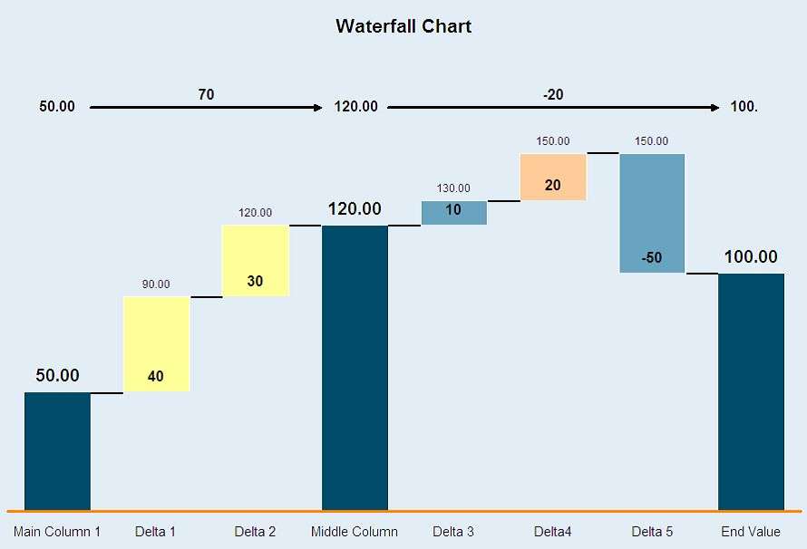
A typical waterfall chart. By Jolivan-wikipedia at English Wikipedia – Own work, Public Domain, https://commons.wikimedia.org/w/index.php?curid=71669820
Creating a Waterfall Chart can be a great way to visualize changes in a set of data over time.
It’s also an effective way to show the cumulative effect of a series of values.
The benefits of using a Waterfall Chart are that it makes it easier to understand the data and to identify trends and patterns.
Plus, it’s a great visual tool that can help you quickly present data to others.
Creating A Waterfall Chart
Creating an effective waterfall chart can be a powerful tool for data visualization. The ability to interpret results, compare and contrast data, accentuate trends, analyze outliers, and present insights is invaluable. By taking the time to understand how this type of graph works you will be able to take your analysis to the next level!
Waterfall charts are most useful when looking at cumulative changes over multiple variables or categories. This allows us to clearly see how certain events have affected our overall performance in relation to other events.
To create a successful waterfall chart you need to start by identifying which sets of data need to be compared and then organize it into individual fields with separate values. Once all the information is collected it’s important that we format our graph correctly so that readers are not overwhelmed by too much information or confused about what they’re seeing.
To further enhance the visual impact of your waterfall chart adding color-coded bars as well as labels and annotations allow us to more easily interact with our data. These features are especially helpful when trying to highlight specific portions of change or draw attention away from irrelevant sections within the dataset.
Additionally utilizing gridlines along with formatting options such as 3D graphs gives added depth making it easier for viewers to make comparisons between different points in time or across different elements within one category.
By using these techniques carefully crafting a visually stimulating and informative waterfall graph provides insightful perspectives on complicated datasets quickly allowing everyone involved in the project gain valuable insight into their outcomes without being bogged down by unnecessary details – making decision-making simpler than ever before!
Benefits Of Waterfall Chart
The waterfall chart is a powerful tool for data visualization, and understanding its advantages can further enhance the effectiveness of this type of graph. There are many benefits to using it including being able to clearly see how certain events have affected our overall performance in comparison with other events, easily highlight specific portions of change, and present insights quickly without getting bogged down by too much detail.
Moreover, gridlines along with 3D graphs provide extra depth allowing viewers to make more informed decisions faster than ever before.
Of course there are some disadvantages associated with creating waterfall charts as well; one example being that the data needs to be organized into individual fields which makes it difficult when dealing with large datasets. Additionally, formatting options such as color-coding or labels require extra effort on behalf of the creator if they want their graph to stand out from others – something that may be overlooked since these features don’t always come built-in like in other programs.
Despite these drawbacks though, waterfall charts still remain an invaluable asset across various industries due to their ability to reveal relationships between different elements within a dataset. From finance reporting and forecasting market trends, to project management and software development – businesses often rely heavily on having accurate information displayed in an easy-to-understand format so they can gain actionable insights about their operations (and competitors).
Overall, while there will always be challenges associated with creating effective visualizations no matter what method you choose – waterfall charts offer unique advantages compared to most alternatives making them worth considering when presenting your results!
Creating An Area Graph
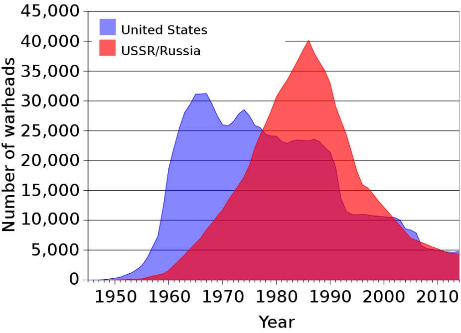
Layered area chart. By Created by Fastfission first by mapping the lines using OpenOffice.org's Calc program, then exporting a graph to SVG, and the performing substantial aesthetic modifications in Inkscape. – Own workSource data from: Robert S. Norris and Hans M. Kristensen, "Global nuclear stockpiles, 1945-2006," Bulletin of the Atomic Scientists 62, no. 4 (July/August 2006), 64-66. Online at http://thebulletin.metapress.com/content/c4120650912x74k7/fulltext.pdf, Public Domain, https://commons.wikimedia.org/w/index.php?curid=1514245
Creating an area graph is a great way to visualize data.
It’s important to begin by creating the data that will be used in the graph.
After that, you’ll need to add the data to the graph, making sure that the values are accurately represented.
Once that’s done, you’ll be able to interpret the data to draw conclusions.
Finally, you’ll be able to share your data visualization with others.
Creating Data
Creating data for an area graph requires careful consideration. Data collection is the first step in creating such a graph, and it’s important to ensure that all information collected is accurate and complete.
To do this, we must assess our data sources to make sure they are reliable and up-to-date before proceeding with any analysis. Once the data has been collected, then comes the task of analyzing it to determine what trends or patterns can be identified. This involves identifying correlations between different variables as well as looking at how these changes over time might affect each other.
Finally, once all the necessary calculations have been done, we need to present the findings in a clear and concise manner by using appropriate charts and graphs. By doing so, we can effectively communicate our results while also making them easier for others to understand.
With careful attention paid to each of these steps in the process, you should be able to create visually appealing area graphs that accurately reflect your data.
Adding Data
Once the data has been collected and assessed for accuracy, it’s time to start analyzing it. We need to identify patterns or correlations between different variables and how they might change over time. This includes looking at any outliers which may affect the overall interpretation of data.
Data cleaning is also important here to ensure that all information is correct before proceeding with further analysis. It’s critical that we use appropriate tools during this process so as to facilitate a more efficient data analysis. From simple scatter plots to more complex algorithms such as regression models, there are many ways in which we can analyze our data.
Once done, we must interpret our findings correctly and draw meaningful conclusions from them without leading people astray. Finally, once all calculations have been made and interpreted correctly, it’s time to present the results using charts and graphs for an easier understanding by others. With careful consideration given to each step of this process, you should be able to create visually appealing area graphs that accurately depict your data and its corresponding trends or changes over time.
Creating A Funnel Chart
Let’s start with the basics: a funnel chart is a type of graph used to represent stages of a process from start to finish. It’s an easy way to visualize where a customer’s journey begins and how it progresses.
Now, let’s move on to the steps of creating a funnel chart. First, you’ll need to decide what process you want to visualize. Then you’ll need to collect all the relevant data. Finally, you’ll need to create the chart in your preferred data visualization software.
The benefits of using funnel charts are numerous: they can help you identify patterns, measure progress, and spot potential areas of improvement. Plus, it’s a great way to communicate complex data to stakeholders in a simple, visual way.
Funnel Chart Basics
A funnel chart is a powerful data visualization tool for interpreting results, understanding metrics, and analyzing trends. It can be used to quickly identify patterns by visualizing data in an easy-to-grasp format.
For example, you could use it to track the progress of leads through your sales process or analyze customer segments that are most likely to convert on your website.
To create a successful funnel chart, there are some basic steps you should follow.
First, decide which type of funnel chart works best with the data you’re trying to visualize—there are various types including traditional pyramid shapes and segmented bar charts.
Then gather all relevant data points from whatever source they may come from—this could include spreadsheets, analytics software like Google Analytics, or surveys sent out to customers.
After gathering the necessary information it’s time to enter your data into the chart properly; this means organizing each section according to their respective size starting at the top of the funnel (the largest) and ending at the bottom (smallest).
By following these steps you’ll ensure accuracy when creating a funnel chart so that it clearly conveys insights about how different elements interact within your business model.
Finally, after adding all associated labels and annotations as needed for clarity’s sake, double check everything before publishing your work!
When done correctly a well-crafted funnel chart will effectively communicate complex information while also providing actionable guidance for further analysis and improvement initiatives – making them invaluable resources for any organization looking to sharpen their competitive edge in today’s market.
Steps To Create A Funnel Chart
Creating a funnel chart is an important step in interpreting data and gaining insights into the performance of any business. When done correctly, it can be highly beneficial to those looking for actionable guidance when making decisions. However, there are some key steps that must be followed in order to ensure accurate results from your funnel chart.
The first thing you should do is decide which type of funnel chart works best for your data – traditional pyramid shapes or segmented bar charts?
Once you’ve made this decision, gather all relevant data points from whatever source they may come from. Then organize each section according to its size starting at the top (largest) and ending at the bottom (smallest).
It’s also essential to add labels and annotations as needed for clarity so that everyone understands what the graph is saying.
Advantages of using a funnel chart include its ability to quickly identify patterns by visually displaying data in an easy-to-grasp format. Furthermore, it allows users to track progress over time and analyze customer segments most likely to convert on their website – both powerful benefits when optimizing your online presence!
On the flip side though, one potential disadvantage could be incorrect interpretation of results due to improper setup or lack of understanding about how elements interact within a given model. This highlights why double checking everything prior to publishing is such an important step!
Overall, with careful consideration and diligence taken throughout the process, creating a successful funnel chart has many advantages and applications that will help businesses stay competitive in today’s market. Whether used for tracking sales numbers or analyzing customer behavior, having a clear visual representation of these metrics offers invaluable insight into future development strategies.
Benefits Of Using Funnel Charts
Using funnel charts can be a great way to understand the effectiveness of your business and track progress over time. They are especially useful for analyzing customer behavior, as well as providing businesses with powerful insights about their conversions and sales numbers.
Funnel charts also provide an attractive visual representation that is easy to comprehend, making it easier to identify patterns in the data and make more informed decisions. Moreover, their accuracy and data integrity are ensured when all necessary steps have been taken during setup – from gathering relevant information to labeling segments properly.
With this kind of precision, you can trust that your funnel chart will give you accurate results every time! All in all, funnel charts offer a versatile tool for any business looking to gain valuable insights into their performance and development strategies.
Creating A Stacked Area Graph
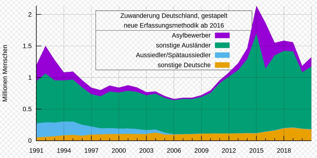
A stacked area chart. By StefanPohl, Hi, future humans! (talk · contribs) – Own work, CC0, https://commons.wikimedia.org/w/index.php?curid=38787355
Data preparation is very important for creating an effective stacked area graph; you need to ensure the data is correctly formatted and organized.
Comprehension of the data is equally important; understanding the variables and how they interact is essential for producing an informative visual.
Visual cues play a large part in data visualization, so using the right graph type, colors, labels, and scales is key for conveying your message clearly.
Data Preparation
Data preparation is essential before creating a stacked area graph. We must ensure that the data we’re collecting is accurate and reliable so it can be analyzed with confidence.
To do this, I recommend double-checking all your sources for accuracy and using robust data collection methods to make sure you have as much detail as possible.
Once we’ve collected our data, we need to analyze it thoroughly in order to understand any patterns or trends which may appear. Data analysis should involve breaking down the figures into meaningful clusters and looking for connections between variables.
After completing our analysis, we then need to interpret our results by summarizing key findings and drawing conclusions from them.
Finally, when presenting the information visually, it’s important to create an engaging display of the data which clearly communicates its meaning. An effective stacked area graph will help bring clarity to complex datasets quickly and effectively!
Data Comprehension
Now that we have prepared our data and understand the patterns and trends, it’s time to move on to data comprehension.
This involves recognizing how different variables interact with one another, as well as getting a better sense of what the numbers actually mean.
To do this effectively, clustering algorithms can be used to group similar values together so they can be interpreted in context.
Data exploration is also important here; by transforming our data into graphs or charts, we can gain an even clearer understanding of the relationships between variables.
Data accuracy remains paramount throughout this process – if any inaccurate conclusions are drawn due to bad data, then all subsequent analysis will be affected.
That’s why double-checking sources before collecting data is so essential!
Ultimately though, gaining insight from even the most complex datasets requires careful consideration and interpretation of results which should always remain unbiased.
By combining these steps for effective data comprehension we’re able to make more informed decisions about our visualizations.
Visual Cues
When it comes to creating a stacked area graph, color coding is essential. By adding different colors and shades to the graph, data interpretation becomes much easier. This can be used for comparative analysis or correlation analysis; basically any type of data storytelling that requires a visual element.
In addition to this, color coding allows us to draw conclusions quickly by making complex relationships more apparent at first glance. Moreover, using varying hues also creates an eye-catching chart which readers are likely to engage with more readily than duller alternatives.
Ultimately, these visuals help us understand our data better and make informed decisions faster – without them we’d be missing out on valuable insights!
Creating A Gauge Chart
Gauge charts offer a great way to visualize data, as they’re visually striking and easy to interpret.
When designing a gauge chart, it’s important to make sure the scales are clearly labelled and the colors are chosen wisely.
When interpreting a gauge chart, it’s important to pay attention to the scale values and the number of divisions.
The benefits of using a gauge chart are that it can help users quickly interpret data and easily identify trends.
Additionally, it’s an effective way to make a data set more visually appealing.
Gauge Chart Design
Gauge charts are an effective way of visually displaying data.
When creating a gauge chart, it’s important to consider accuracy and readability. Reading tips include making sure the scale is easily understood by viewers, using consistent color schemes throughout the graph, and providing meaningful labels that clearly explain your findings.
Interpreting data with a gauge chart can be done relatively quickly as long as you have chosen accurate measurements for visualization. It’s also helpful to look at trends over time when visualizing data; this will help make sense of any changes or patterns in your information. Paying attention to how much each bar represents on the graph is essential in order to accurately analyze the data.
Data analysis becomes simpler when utilizing a gauge chart for visualization because it allows you to measure progress towards goals while tracking fluctuating numbers. Gauges can be used for comparing current performance against targets, allowing users to spot areas where there is room for improvement within their business operations.
Creating eye-catching visuals with a gauge chart makes data easier to understand and comprehend in comparison to raw figures – but only if they are designed properly! Keep these tips in mind when designing yours for optimal understanding and clarity among readers.
Gauge Chart Interpretation
Once you have created your gauge chart, it is important to interpret the data accurately. Data interpretation involves assessing accuracy and determining how changes or patterns in information can be understood. By interpreting the data correctly, you’ll uncover valuable insights that will help inform decisions within your organization.
Data analysis becomes a much simpler task when utilizing a gauge chart for visualization as it allows you to measure progress towards goals while tracking fluctuating numbers.
Gauges are useful tools for comparing current performance against targets, helping users identify areas where improvement may be necessary in order to achieve their objectives.
Interpreting data with a gauge chart quickly requires having accurate measurements, so make sure that all of your readings are precise before creating the graph. It’s also helpful to look at trends over time – this will provide further clarity on any changes or patterns observed from the visualized data.
Paying attention to how much each bar represents on the graph is essential in order to ensure an accurate assessment of the results. By looking closely at your gauge chart and considering these tips, you’ll be able to get more out of your visuals and gain deeper insights into the data being presented – allowing for better decision making!
Gauge Chart Benefits
Gauge charts provide a range of benefits in terms of data visualization, allowing users to quickly interpret and compare different sets of information. Their visual nature makes them particularly useful for communicating complex ideas or concepts that require precise measurements.
Additionally, gauge charts enable easy comparison between various levels or ranges, so they’re great for tracking performance over time. When it comes to gauge chart features, these typically include customizable color schemes, adjustable sizes and shapes as well as the ability to add labels and annotations.
The applications of gauge charts are wide-ranging; they can be used to communicate progress towards goals or objectives within an organization, track customer satisfaction scores across departments or monitor fluctuations in economic indicators such as stock prices or exchange rates. They’re also helpful when comparing two distinct pieces of data: this could involve contrasting company profits from one period against those achieved during another quarter, for example.
Despite their many advantages though, there are some drawbacks associated with using gauge charts – namely that they’re often difficult to read if too much data is presented at once or if the graph isn’t properly labelled and annotated.
When it comes to comparisons between other types of graphs, gauge charts offer more flexibility than traditional bar graphs but less detail than line graphs – however this depends on what type of information needs to be conveyed by the user. Gauge chart visualization should always prioritize accuracy above all else – so make sure you double-check your figures before creating the graph!
Ultimately, gauges are a powerful tool for presenting data visually and will help achieve greater understanding about any given set of results.
Conclusion
Data visualization is a powerful tool for data analysis and interpretation. With the right graphs and charts, you can communicate complex information quickly and clearly.
By understanding the different types of visualizations available, selecting the best type to use for your data, preparing your data properly before creating any visuals, and knowing how to create each graph or chart in detail, you will be able to effectively present your findings.
In this way, you’ll have the power to move audiences with compelling insights that are illustrated through effective data visualization – figuratively speaking!
